As another calendar year comes to an end, I am happy to announce that once again my dear friends at Oracle have been busy crossing off my Enterprise Data Management wish list. The 24.12 patch boasts nearly 30 new updates – many around the new merge/match functionality, import/export options, and REST APIs. However, for me, the most exciting feature has come to us as a “ghost of Christmas past” so to speak – as a re-imagined, yet haunting, feature from the Oracle DRM days.
As some of the legacy DRM folks know, at the time that Oracle began working Hyperion suite into cloud, they were still investing in Hyperion with new features. One of which in Oracle Hyperion DRM was DRM Analytics (“DRM-A”). Now, I can’t find much about “DRM-A” out there anymore, but essentially this was intended to be an analytics feature that sat ontop of your DRM instance that provided insights into how your master data was changing over time and trends related to workflow approvals, etc. At the time, it gained minimal popularity as most organizations chose to pivot and invest in cloud technologies, an eventually EDM.
Well the time has come for the ghost of DRM-A to be reincarnated into what we now now as EDM’s Change Management Dashboard.
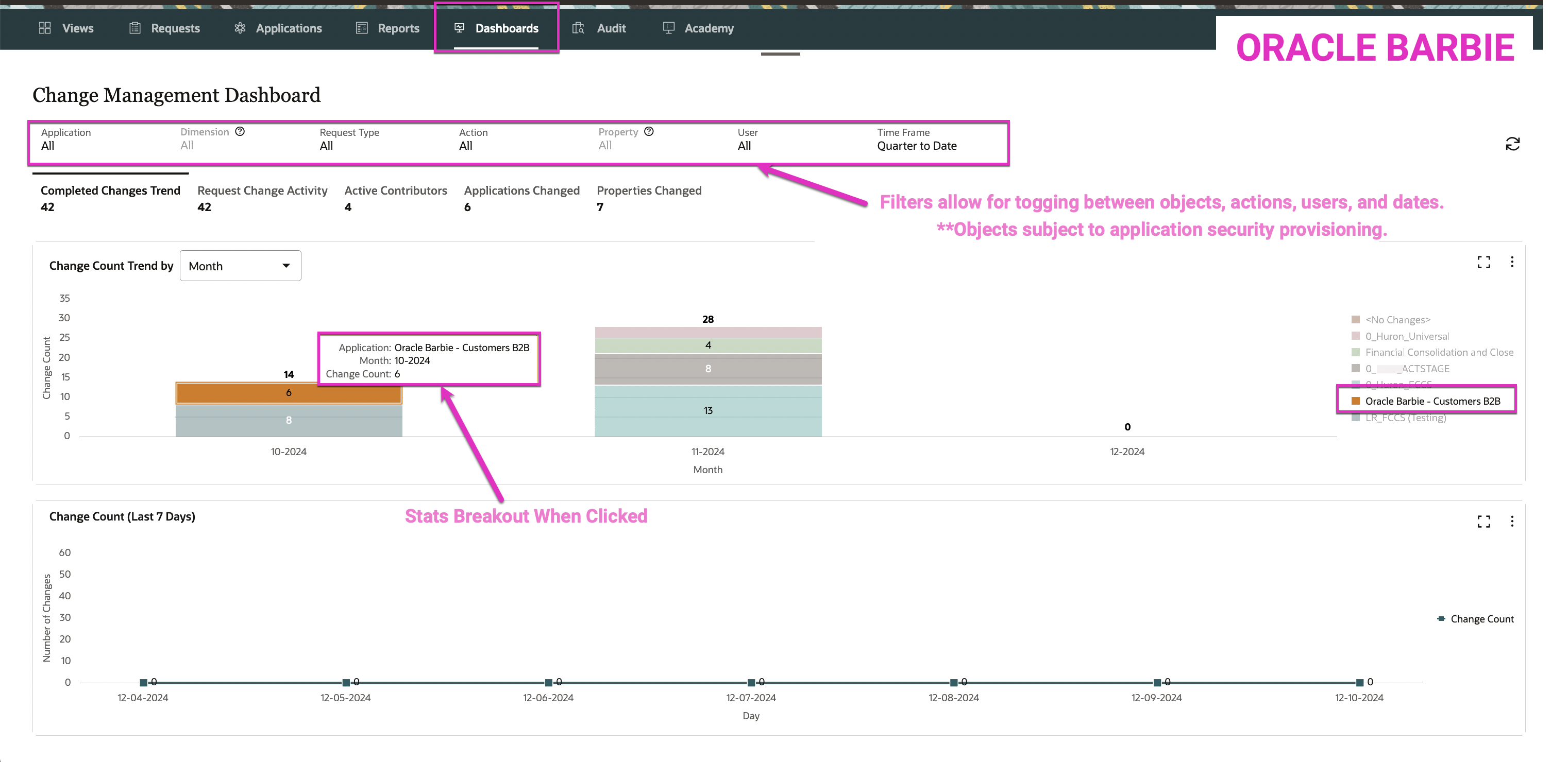
The EDM Change Management Dashboard unlocked a new “card” or “tile” in the EDM interface called “Dashboards” visible to Data Managers and above (Metadata Manager, Owner, System Administrator):

From here, the Dashboard page displays many filter options and live graphs that live-display the filter changes ease; similar to (if not exactly the same back-end architecture as) Dashboards 2.0 in EPM. One of my favorite features is when you hover over a piece of a graph, it displays detailed statistics about that piece.
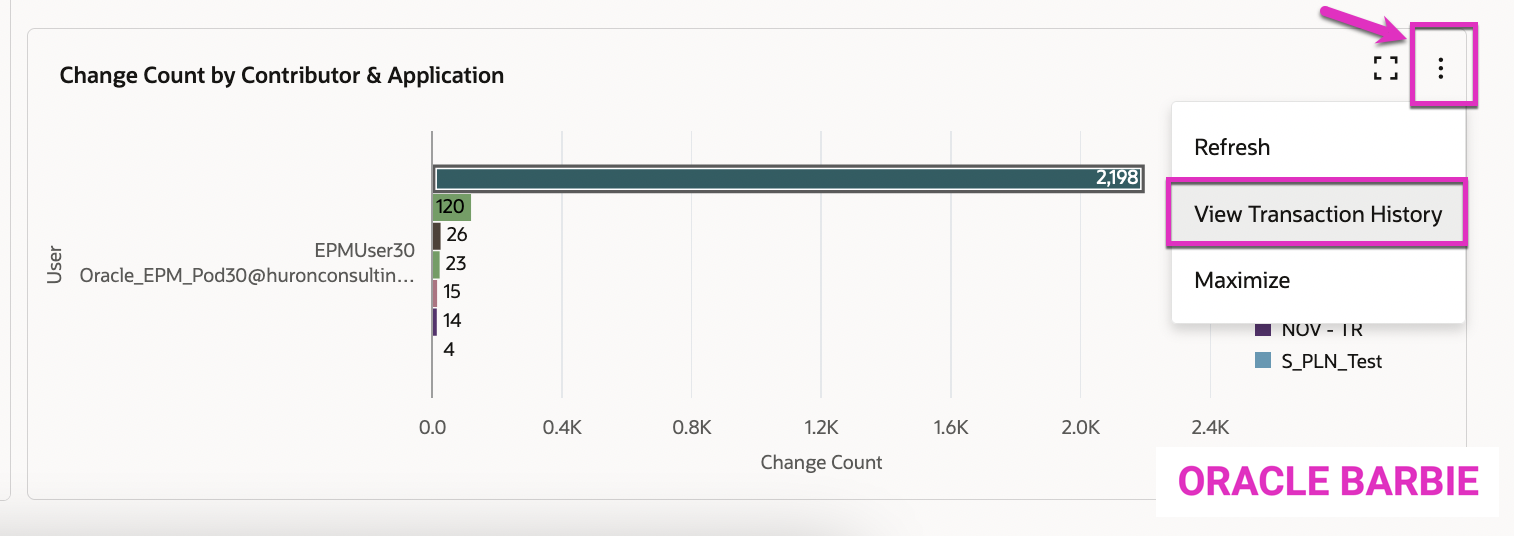
Another great feature is that for all of the data displayed on each graph/dashboard, is that you can drill into (and optionally download) the supporting transaction log history. To do so, click the 3 dots on the right-top corner of each graph and select “View Transaction History”:
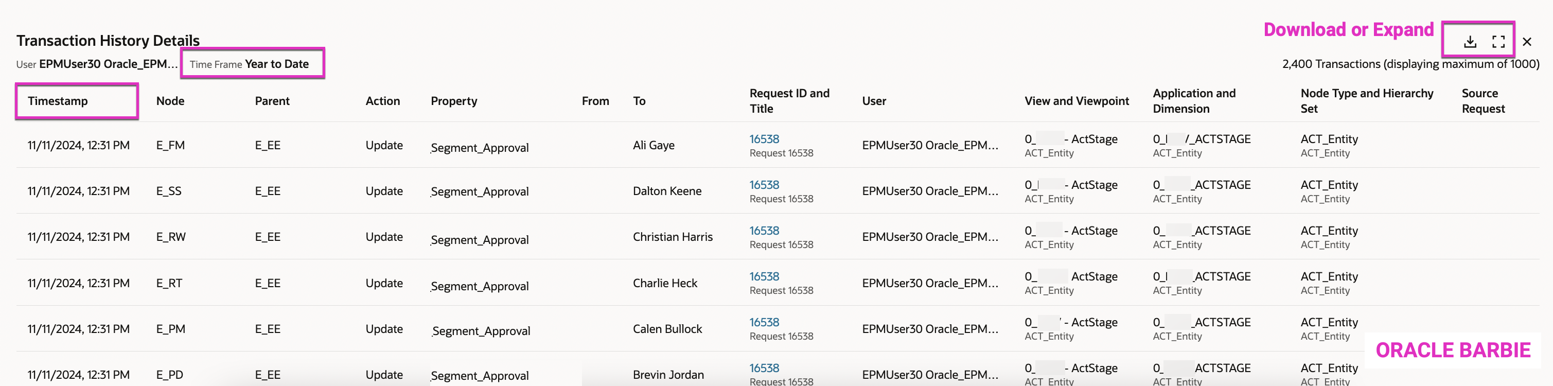
The Transaction history then pops out of the bottom of the page, about halfway through the window. From here you can expand it to be the entire webpage or download it to file, if needed. Or, you can scroll through the underlying data and click on the blue hyperlink to bring you to a specific request. One thing to note, is that currently the transaction history is ordered newest-to-oldest based on your time filter. I’d assume that in future enhancements, Oracle will allow these windows to become more dynamic and allow for sort options and/or additional filtering:
The Change Management Dashboard is currently broken into 5 different Dashboard pages, we’ll go into detail on each one:
- Completed Changes Trend
- Request Change Activity
- Active Contributors
- Applications Changed
- Properties Changed
1. Completed Changes Trend
The Completed Changes Trend is the default page of the Dashboards and allows you to see all changes that have been completed in the system over a duration of time. There are a number of filters available across the top of the panel that allow you to filter by:
- Application can select one or many
- Dimension can select one or many, only active when an Application is specified
- Request Type Interactive, Subscription, Consolidation, Load, Import
- Action Add, Update, Delete, Remove, Insert, Move, Rename, Reorder
- Property only active when the Update Action is selected
- User list of available users that could make changes
- Time Frame predefined time buckets or custom range available
There are two dashboards visible at this time. The top one is Change Count Trend by <Time Period> – either Month or Quarter, depending on your Time Frame filter. This summarizes by time frame the number of changes and breaks it out by Application or Dimension.
As shown below, you can see I’ve filtered on Quarter to Date, and there were 42 changes made during this time period, and in October 2024 (10-2024) there were 6 changes made to my Oracle Barbie – Customers (B2B) Application.
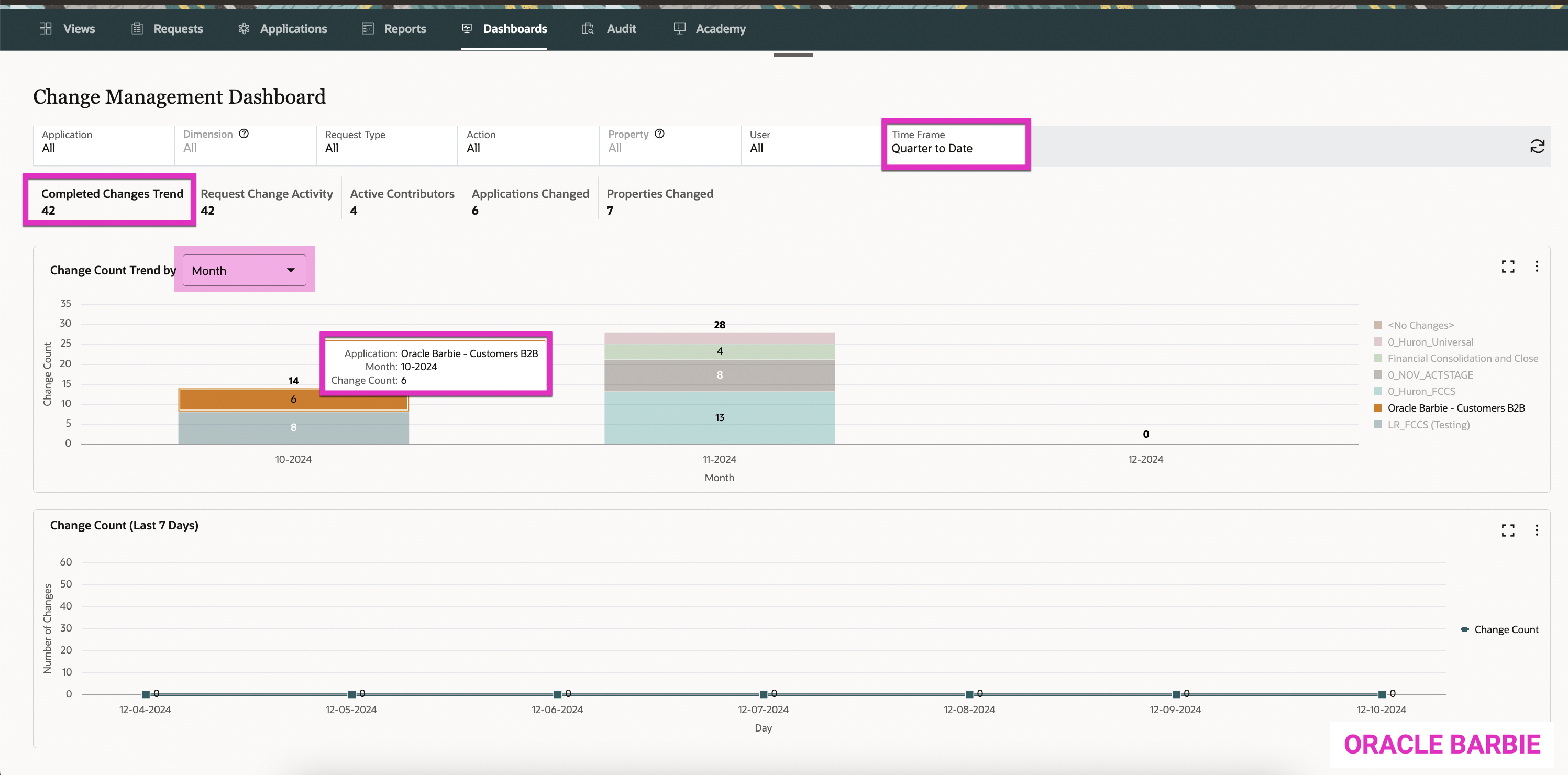
The 2nd dashboard is the Change Count (Last 7 Days) that shows trends over the past week. My application has been pretty quiet, but you can imagine in organizations with high volumes of changes, it will be nice to chart trends over time and be able to drill into the Application and Dimension levels of detail with the filters.
Example: Be able to see how many new customers were added within the last week to my sales planning application.
2. Request Change Activity
The Request Change Activity tab shows the make up all of the changes that have occurred within EDM. Again, you can filter by Application and then Dimension, Request Type, Action and then Property, or User for a specified Time Frame.
This tab has two additional dashboards, the first of which being Change Count by Action Type. This summarizes the changes by Action Types. It has a horizontal bar chart and documents the types of changes by Action Type for specified Applications/Dimensions.
This is very helpful for giving context to the types of changes to the data – are users mainly Updating enterprise data? Are they adding faster than they are Updating it? Are they deleting it more frequently this quarter vs. other quarters? Etc.
In this example below for the Change Count by Action Type dashboard on the left, you can see I have the Quarter to Date time filter selected. For this time period in my app, 47 total changes have occurred across all of my EDM applications. I’ve isolated in the “Update” Action Types that my Oracle Barbie- Customers B2B application received 4 Update changes within this time period.
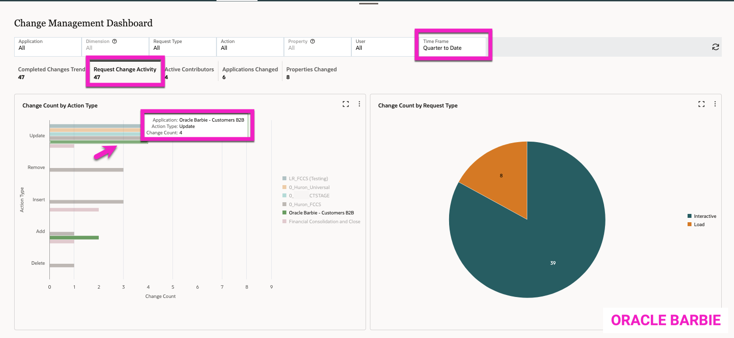
The Change Count by Request Type, the dashboard on the right, is another helpful graph that gives context to the changes that have occurred in the Time Frame. This breaks down the Request Type; meaning if it is an Interactive/user driven request, a Subscription request, a Load/Import/Consolidation request, etc. This gives you additional context to the changes on if they are from users or from another type of process (an automated import or a subscription routine).
In this example, now above, the 47 changes from the quarter are broken into two types of requests: Load requests were 8 of the requests, while the remaining 39 were from Interactive (user-driven) requests.
3. Active Contributors
The Active Contributors tab on the Change Management Dashboard shows a breakdown of users and their actions within EDM over the designated Time Frame.
On the left, there’s a “word cloud” graphic that shows your most active contributors as the largest fonts:
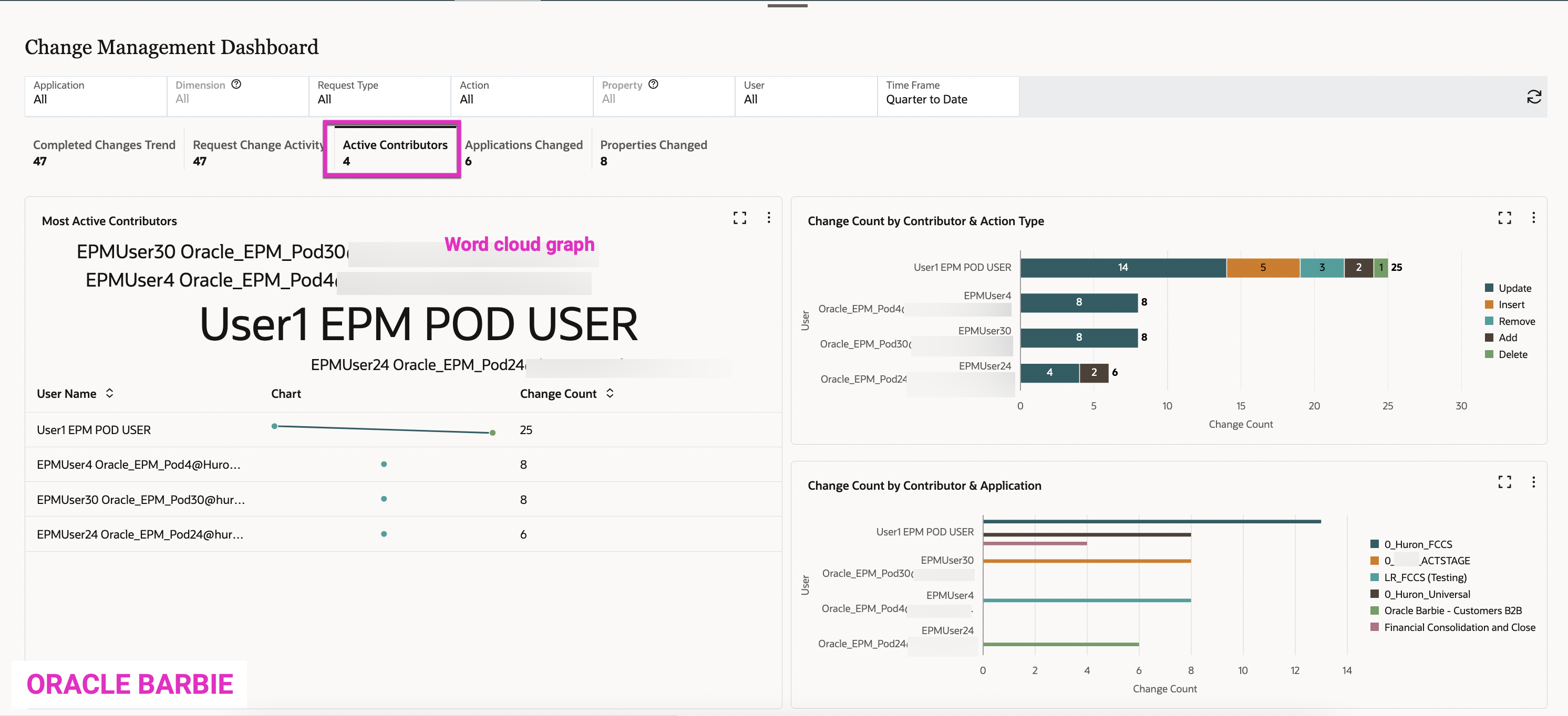
Below this shows a line graph by user with amount of changes. This can help show activity over time by your users.
The right side of the dashboard shows two graphics. The top one shows your contributors/users within the system and then a corresponding bar chart of the request actions by Action Type. This can show you how users are interacting with data – are they mainly updating data or adding new? Which users that are deleting or removing data? etc.
The bottom graphic breaks out the Users by updates to applications. This can be helpful to see the patterns of your users and with which applications they interact.
4. Applications Changed
The Applications Changed tab breaks down the changes over the selected Time Frame by Application. This is also summarized on the tab (this example below shows 6 Applications were changed within the Quarter to Date).
The left displays a circular heat map that breaks out the Applications and Dimensions that had the most changes. For example, in my Quarter to Date view, the 0_Huron_FCCS Application’s FCCS_Account Dimension received 13 updates.

The graphic on the right shows the Applications & contributing users to the updates, ordered/sized in relation to the number of updates. This example shows that the 0_Huron_FCCS application had the most updates by User 1.
5. Properties Changed
The last tab on the Change Management Dashboard shows the Properties Changed within the Time Frame in another word cloud format. It’s important to note that this screen is only applicable to the Update Action Code; so if you filter by Action on any other Action type, the dashboard will be blank.
As you can see on the left below, the Core.Description property has had the most changes at 13,509 (this is a Year to Date view of my data). It also has a list of the properties that have been changed in descending order of # of changes.
On the right, you can see the top twenty properties that have been changed and the top contributor to those. Again, the Core.Description property has had a lot of changes, and EPMUser25 appears to have made the most changes.

Thoughts and next steps…
The new Change Management Dashboard is a great milestone in EDM, as it now allows you to have real analytics on data and what’s happening within the system. The dashboards are easy to read, easy to view underlying data, and provide valuable insights.
My hope is that in future releases Oracle will provide additional dashboards related to the workflows/policies being executed over time and analytics around that. As an EDM admininstrator, I think it would be very valuable to see analytics of how long requests are taking by dimension, and who your bottlenecks are in approvals. These insights can help you determine if configuration changes / mitigations can be done to improve efficiency in the data governance process or see where the business processes can be improved.

Kate, excellent post on EDM updates and dashboard functionality. Dashboarding capability is a critical component for customers who has large footprint and dependencies on master data management tools. DRM dashboard feature was an add on feature with a cost associated with it. Some customers built their own DRM dashboarding capabilities since they had access to underlying DB. It’s nice to see Oracle introducing this feature out of the box and this is just the beginning.